Sunday, October 26, 2008

Evening, Quentin.


The assignment in drawing class this week was to create a scene for a film with one dramatic light source and draw it using five shades of white to black. You'd think this would be right up my ally, being an aspiring filmmaker and all, but no. Of course I can't take it seriously. So I decide I want to draw something that looks like it would be in a crappy John Travolta action movie :)
And so, this was born. xP
I quite like it.
Like all my drawings, it is an 18x24 in real life. So it's big. Yup.
Do you like it?
Do you hate it?
??????????????????????????????????????????????????
=]

Thursday, October 23, 2008

More and more and more posts......


By GOLLY I really really really need to start taking better pictures of my drawings!!! D:
ANYWAY. I'm pretty proud of this one. It took a lot of time to get into--- I wasn't really feeling the groove at first tonight, and it was pretty bad at first. Then I pulled my head out of my bootay and came up with something pretty good. My classmates and professor really dug it =]
I'm growing quite confident in my drawing ability. Not confident like douchey; confident like a little kid who's parents keep telling her that she's the best dancer in all the land. I'm so stoked! Just don't mistake my glee for hubris, please! =P
So...... Yeah.
You should leave me 2 bazillion comments.

Wednesday, October 22, 2008

What I Dig.

So here I am, sitting at home, waiting to go to theatre. I started working on painting a multimedia piece I'm working on. It's really not too spectacular: mostly just kind of playing around. I don't know whether I'm done yet. I was going to do more to it, but I'm really liking how it looks now, as there is already a lot going on. I'm not so sure how I'd feel about it if I did too much more. Ah well. I'll sleep on it. I'll post a picture of it when I'm done.
Also, I wrote the first draft of my "Personal Statement of Interest" essay for college applications! Yay, responsibility!
Anyway, I have rehearsal in an hour, and now I have nothing to do. So I thought it'd be kind of fun to just talk about my influences.
So, some of my favorites are (but not necessarily limited to)
Wes Anderson
Not only are his films my favorites, but he is really really really ridiculously good-looking. Ladies; google image search him.
(Image from The Life Aquatic)
Francis Picabia
Because his imagination is so vivid and detailed.
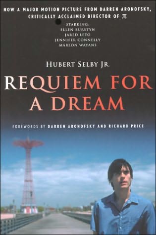
Hubert Selby, Jr.
One of the best avant-garde writers we will ever know.

Alberto Giacometti
For his unique aesthetic and personal style.

Bret Easton Ellis
For when I want to have a little fun =]

His satires are HILARIOUS. American Psycho is brilliant. And Glamorama is basically the novel form of Zoolander.

So.... yeah. I love these men for their innovation. Don't misinterpret me; I don't want to be anything like them. I want to be as innovative as they are someday; but I want to create my own styles that is unlike theirs or anybody elses.

....And for those of you who don't know, I want to be a filmmaker when I grow up. And I WILL be interning with Wes Anderson someday =]

That is all.

Tuesday, October 21, 2008

A Day at the Park............


From a senior picture session with the James. Yep. That's right. THE James. =]
I'm only posting two.... I was going to do three, but then I got lazy and I have to start getting ready to go to rehearsal pretty soon! Haha!
Anyways, James will be editing his own photos, these are just a couple I did for my own amusement =]
After our li'l senior sesh, I made a crappy stop motion with Jenna and Jenny, which I'll probably post when I finish--- it's pretty low on my priority list, however, what with school and everything taking main priority, so it may be awhile!
In short, I spent a lot of time taking pictures at parks that day. And preying on small children who were at the parks while we were trying to take pictures.
UGH why are there all these little kids at the park?? Shouldn't they be playing at home playing video games?!
Thank you for reading!

Saturday, October 18, 2008

Contrasty Charcoalness


Wow. Blurry pic. I REALLY gotta start documenting things better. When I have my official applications portfolio done, I'll have good pics of my important drawings and whatnots, I promise! =]
More importantly; this drawing. Produced for my foundation drawing class at MCAD. This week, we were required to use only 3 shades in our image; white, middle grey, and black. The result; EXTREME contrast and abstraction. My professor told me it was best in the class, so I'm really ridiculously excited about it =] I wish I could show you the real picture... It looks so cool in real life....
Tell me what you think!
Please and thank you!

Monday, October 13, 2008

What?! Two Posts in One Day?! Has the World Gone MAD?!?!?


OUTRAGEOUS
But that's okay. I guess I just have a lot of new stuff today (?)
Okay. So. Here I have a new self-portrait, done in charcoal, using planar analysis and hatching.
The full-size picture is quite blurry, but you get the idea.
Also, SO MUCH PORTRAITURE, ALEX! WHAT THE CRAP, MAN?!

Anyway. The face looks really tight in real life. If you ever want to see it live, I can show you :)

I'd love to hear what you think!
And just in case you didn't know; you CAN comment on blogs even if you don't have a blogspot account thinger. So... You should leave me comments :) Yay!

The Infamous "Text" Assignment

"Tension"
"Tranquility"


Those of you from PLHS are probably familiar with the text assignments in Graphic Design class. Obviously, these are not the most professional of designs--- but they sure are fun :)
I'd like to begin by discussing the bottom two designs. We had to choose one letter for each graphic and, using that letter, create two graphics; one that communicated tension and one that communicated tranquility. I must admit, I'm particularly unhappy with the tension one--- but meh. Why not post it and be a sillyface?
We were allowed a little more freedom on the top one. We were each assigned a letter and then we were free to do pretty much whatever we wanted with it--- so long as we only used text. I was assigned the letter "T", if you couldn't tell. :)
So...... Yep. That's about all I have to say about that.
Comments? Questions? Concerns?

Thursday, October 9, 2008

New Drawing.... (but not a lot of time spent on it, sorry!)


New charcoal still life!

Another product of my drawing class.........

(this class has taken over my life, by the way. Every time I close my eyes I see charcoal skulls in still lifes. Every time I sleep I have nightmares about drawing.)
Just made this one in class today; we only had three hours to work on it, usually we spend at least five, but it was an interesting new project in value, which compelled me to share it.
I don't like the hatching on the floor..... My teacher came up to me and put the hatching on there to show me what she wanted, and I was kind of sad cuz I liked it A LOT better before that ):
But hey. That's what happens when you study art.
As I've repeatedly said, I did NOT spend a lot of time on this drawing, so please don't be hatin' too much :) Bahahahahaha
What do you think?

Monday, October 6, 2008

A Couple O' New Charcoals!


I feel like I'm posting blogs far too frequently...... Ah, well.
I have a couple new charcoal drawings I wanted to share with you. Both of them are about 22.5 x 30 inches in real life, so the images aren't very accurate.... I gotta start documenting things better.
Yup.
Those are drawings all right.
The top one is a still life drawn from our ever-changing ginormous still lifes in good ol' room M205 at MCAD!
The second is a self-portrait, done in a less-than-realistic style, but I think looks kinda neat!
Thoughts?

Sunday, October 5, 2008

Snuffalicious


More senior pictures! Yay! Hooray!


This round contains images of one of my favorite cousins, the infamous David "Snuff" O'Fallon. We tried a couple interesting new locations for our shoot; they turned out pretty sweet! Peep 'em!

Friday, October 3, 2008

"The Whole Kitchen Sink"


So first off, I have this new drawing I did in my Foundation Drawing class at the Minneapolis College of Art and Design. The assignment was simply to draw our kitchen sink filled with dishes (using pencil), so it's not the most riveting subject, nor is my technical skill too outstanding, but I got a REALLY good grade on this, so I'm proud of myself, cuz I'm a four-year-old kid who gets excited easily :)
And I'm sorry about the low quality of the picture documentation; I just took a quick photo of it and didn't pay too much attention to lighting and graininess, et cetera. This isn't going in my portfolio or anything, so it's not too important.... I promise it looks better than this in real life, though! Haha!
Not an exciting piece, I know; but I have more coming! I'm currently working on a couple of charcoal drawings that I'm really stoked on, so those will be up soon, when they're ready! I look forward to posting them! =D

This second image, obviously, is not a work of mine. Yesterday, I saw a lecture from a furnituremaker named Jack Larimore. He works in wood and makes really organic pieces--- it's not my style, but it was so interesting to hear his perception of art and his thinking process were intriguing to me. He talked a lot about his inspiration from nature, and how he gets most of his inspiration from looking at the material rather than drafting, although he doesn't limit himself to any certain approach toward creation. I also liked what he had to say about furniture as a medium; he said he prefers furniture rather than sculpture because it interacts in an individuals life and really impacts life in general. He also discussed art as the process rather than the product (a crucial debate in the art world) and made some very interesting points.

You can check out his portfolio here: http://www.jacklarimore.com/portfolio/tables/03_wldrf_bfft.html

Thanks for checking my blog out!